Web Accessibility Standards: A Practical Guide for Business Websites
Making your website accessible is not just a legal requirement. It is good business that expands your audience and improves experience for everyone.
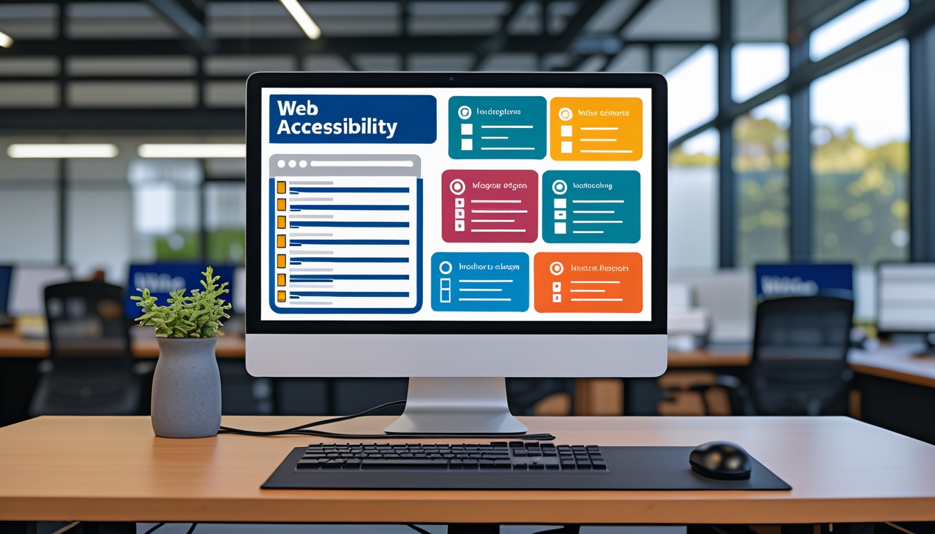
Web accessibility is the practice of building websites that can be used by everyone, including people with visual, auditory, motor, and cognitive disabilities. In Australia, the Disability Discrimination Act 1992 requires that websites accessible to the public be usable by people with disabilities, and the Web Content Accessibility Guidelines published by the World Wide Web Consortium provide the technical standards that define what accessible means in practice. Beyond legal compliance, accessible websites reach a larger audience, perform better in search engines, and provide a better experience for all users, not just those with disabilities.
Understanding WCAG
The Web Content Accessibility Guidelines are organised around four principles, often referred to by the acronym POUR. Content must be Perceivable, meaning users can identify content through their available senses. Content must be Operable, meaning users can navigate and interact with the interface. Content must be Understandable, meaning users can comprehend both the content and how the interface works. And content must be Robust, meaning it works reliably across different browsers, devices, and assistive technologies.
WCAG defines three conformance levels. Level A covers the most basic accessibility requirements. Level AA is the standard most organisations aim for and is the level referenced in most legal and regulatory contexts. Level AAA represents the highest level of accessibility and includes requirements that are not achievable for all content types. We recommend targeting WCAG 2.2 Level AA as the baseline for all business websites, as this level addresses the accessibility needs of the vast majority of users while remaining achievable for most websites.
Each WCAG success criterion describes a specific requirement with testable outcomes. For example, success criterion 1.1.1 requires that all non-text content has a text alternative that serves the equivalent purpose. Success criterion 1.4.3 requires that text has a contrast ratio of at least 4.5 to 1 against its background. These specific, measurable criteria make it possible to objectively evaluate a website's accessibility rather than relying on subjective assessment.
Common Accessibility Issues and How to Fix Them
Image alt text is the most frequently cited accessibility issue, and it is one of the easiest to fix. Every meaningful image on your website needs an alt attribute that describes the image's content or purpose. A product photo should describe the product. A chart should summarise the data it presents. A decorative image that adds no informational value should have an empty alt attribute so screen readers skip it entirely rather than announcing the file name.
Colour contrast affects readability for users with low vision and colour blindness, which affects approximately 8 percent of men and 0.5 percent of women. Text must have sufficient contrast against its background to be legible. WCAG 2.2 Level AA requires a contrast ratio of at least 4.5 to 1 for normal text and 3 to 1 for large text. Many popular design trends, like light grey text on white backgrounds or text overlaid on photos, fail these contrast requirements. We test every colour combination in our designs against WCAG contrast requirements before development begins.
Keyboard navigation is essential for users who cannot use a mouse, including people with motor disabilities, power users, and screen reader users. Every interactive element on your website must be reachable and operable using only the keyboard. This means links, buttons, form fields, dropdown menus, modal dialogs, and custom interactive components must all be focusable and respond to keyboard input. The tab order should follow a logical sequence that matches the visual layout, and a visible focus indicator must show which element is currently selected.
Form accessibility is an area where many websites fall short. Every form field needs a visible label that is programmatically associated with the field using the label element's for attribute. Placeholder text is not a substitute for labels, as it disappears when the user starts typing and is not reliably announced by all screen readers. Error messages should clearly identify which field has an error and describe how to fix it. Required fields should be indicated both visually and in the field's markup.
Semantic HTML: The Foundation of Accessibility
Semantic HTML is the single most impactful accessibility practice, and it requires no additional effort beyond using the right HTML elements for their intended purpose. Using heading elements in order from h1 to h6 creates a document outline that screen reader users can navigate efficiently. Using nav elements for navigation, main for the primary content, aside for secondary content, and footer for footer information allows assistive technologies to help users jump directly to the section they need.
Buttons should be button elements, not styled divs or spans with click handlers. Links should be anchor elements with meaningful link text, not generic phrases like click here or read more. Lists should use ul, ol, or dl elements rather than line-break-separated text. Tables should use proper thead, tbody, and th elements with scope attributes. Each of these semantic choices provides information to assistive technologies that enables more effective navigation and comprehension.
ARIA attributes supplement semantic HTML when native elements are insufficient. A custom dropdown menu might use aria-expanded to indicate whether it is open, aria-haspopup to indicate that it opens a menu, and role=menu and role=menuitem to describe the dropdown's structure. However, ARIA should be used as a last resort, not a first choice. The first rule of ARIA is: if you can use a native HTML element with the semantics and behaviour you require, do so. Native elements come with built-in accessibility that ARIA can only partially replicate.
Testing for Accessibility
Automated testing tools like axe DevTools, WAVE, and Lighthouse can identify many common accessibility issues, including missing alt text, insufficient contrast, missing form labels, and incorrect heading structure. We run automated accessibility checks on every page during development and include them in our CI/CD pipeline to catch regressions before they reach production. However, automated tools can only identify about 30 to 40 percent of WCAG issues. Many requirements, like whether alt text is actually meaningful or whether the tab order is logical, require human judgment.
Manual testing with a keyboard is essential and easy to perform. Navigate your entire website using only the Tab, Enter, Escape, and arrow keys. Can you reach every interactive element? Can you activate buttons and links? Can you navigate dropdown menus and close modal dialogs? Is the currently focused element always visible? This simple test reveals a surprising number of issues that automated tools miss.
Testing with screen readers provides the most comprehensive view of your website's accessibility. VoiceOver is built into macOS and iOS, NVDA is a free screen reader for Windows, and TalkBack is built into Android. Listen to how your website sounds when read aloud. Is the content order logical? Are interactive elements announced with appropriate roles and states? Can you complete key tasks like submitting a form or navigating to a specific page? Screen reader testing requires some practice but provides invaluable insight into the experience of users who rely on assistive technology.
The Business Case for Accessibility
Approximately 18 percent of Australians have a disability, representing a significant portion of your potential audience. Websites that exclude these users through poor accessibility are leaving money on the table. Beyond direct revenue impact, accessible websites tend to perform better in search engines because many accessibility best practices, like proper heading structure, descriptive link text, and image alt text, also improve SEO.
Accessibility improvements benefit all users, not just those with disabilities. Captions on videos help users in noisy environments or those who prefer reading. Sufficient colour contrast improves readability in bright sunlight. Keyboard navigation helps power users work more efficiently. Clear, consistent navigation helps everyone find what they need. Building for accessibility is building for a better user experience overall.
Key Takeaways
Web accessibility is a legal requirement in Australia and a business opportunity that expands your audience and improves experience for everyone. Target WCAG 2.2 Level AA as your baseline standard. Use semantic HTML as the foundation of accessibility. Ensure sufficient colour contrast, meaningful alt text, keyboard navigability, and accessible forms. Test with automated tools, keyboard navigation, and screen readers. Treat accessibility as an ongoing practice, not a one-time checkbox, and build it into your development process from the start. At BuildLane Dev, we build accessibility into every project because inclusive design is better design.
Is Your Website Accessible?
We audit websites for WCAG compliance and implement fixes to make your site usable by everyone.
Get an Accessibility Audit